
Columbia Titlecards!
The quality of the films may have varied, but Columbia's titlecard designs were always top-notch. Even when the studio began falling back on stock layouts for the shorts' cards, the bouncy typography always kept them interesting. Here are cards for three of Charley Chase's (underrated) Columbia shorts. The portrait cards are naturally my favorites for any of the Columbia series. The sweeping cursive script and stylish deco background nicely reflects the mock-sophisticated tone of Chase's comedy.
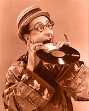
 Harry Langdon wandered in and out of Columbia's shorts unit long enough to receive a wide variety of titlecards. Again, the portrait cards are the nicest. As you can see, Harry wore a mustache in a few shorts. The brushy model he wore in A Doggone Mixup (1938) is far less obnoxious than the pencil-thin monstrosity that teeters on the edge of his lip in Counsel on De Fence (1934). The mustache on the titlecard for A Doggone Mixup is drawn on. Harry's final solution to the problem of adequately visually maturing his "baby" character was to wear a pair of glasses, as seen in Misbehaving Husbands (1940) and Swingin' on a Rainbow (1945) at Monogram. Sadly, Harry eventually became "and Harry Langdon" at Columbia. At least Keaton never had to receive second billing to El Brendel!
 And speaking of El, here are some of his titlecards. El must have had a hell of an agent.. He gets billing over Shemp Howard, too! They do make a better team than Brendel and Langdon, though. Just.
Miscellaneous. The Allen Jenkins and Sidney and Murray cards look as though they were created somewhere other than Columbia's usual titles department... In fact, there's something extremely Warners-ish about the Jenkins card. A late return to portrait cards with Muriel Landers in Tricky Chicks (1957). Columbia's one-shot Our Gang-knockoff Kids Will be Kids (1954) is every bit as bad as rumored and then some. Heaven knows what Jules White was thinking when he cast "The Mischief Makers". Kids who can't act are one thing, but kids who can't act who have been instructed to ape their director's every gesture and line read is something else entirely. As a director, White micromanaged many of the comics he employed, but his technique really backfires here.

Labels: Charlie Chase, cinema, El Brendel, Harry Langdon
posted by Aaron Neathery at 6:14 AM
![]()


6 Comments:
Were we brothers in another life? I, too, have always had a fascination with title cards. The best title cards for the Stooges were their earliest (when Curly's name was still spelled with an "e"). That huge photo of them (Larry confused, Moe ticked-off, Curly with a finger to his mouth) is as iconic an image as I've ever seen.
Boy, these titles -- "Pistol Packin' Nitwits," "The Champ's a Chump," "Defective Detectives -- was Columbia deliberately selling their comics as a bunch of idiots? Maybe it's a good thing Jules White didn't get his hands on Laurel & Hardy after they left Roach.
Call me strange, I've always been fascinated by the title cards, too. I always liked the pre 1940 Columbia cards, they were all great art in themselves. Thanks for posting some I've never seen before. Would love to see more of them. Thank you for featuring Columbia shorts in your blog from time to time!
I think it would have been a more positive move for Stan and Ollie to go to work at Columbia. It's something that I really wish would have happened. Oh well.
If you want to see more title cards (and the films themselves) drop on by my site.
www.theshortsdepartment.bravehost.com
Thanks!
Greg Hilbrich
Laurel and Hardy certainly got the idiot treatment at Fox and MGM! The country's post-depression preference for cynical comedy still made allowances for outlandish, otherwordly clowns, but only on the condition that the clowns be presented as being in some way inferior to society at large. It happened to just about every 20s/30s comic still in the game.. even the Marx Brothers (which is shocking to me). Fox took great pains to paint Stan and Babe as pitiable idiots, a tactic that only really softened by the time they shot The Bullfighters. Columbia tended to split the difference. The titles of the shorts played up the concept of comic inferiority, but the films themselves never really try to contrast the comics' behavior with that of "normal" people (unlike Fox which usually surrounded L&H with straight-laced young lovers and short-tempered sergeants). Columbia's short comedies mostly take place in the same self-contained neverland that slapstick comedies had been taking place in since the days of Sennett, making distinctions between idiocy and normalcy entirely moot.
Sorry to be late to this party. I also agree heartily with how good these title cards are. Years ago, I saw a Walter Catlett comedy (Static in the Attic?), about which I recall little. But discovering that the Columbias all had head shot titles was weirdly thrilling.
If you have any more (Leon Errol, Kennedy-Collins, Polly Moran), please do post.
As a frustrated carnival wagon sign painter I turned to looking at the lettering in the movies. The Columiba Pictures releases always caught my attention with their elegant script lettering. There was, has, and never will again be a studio or (those who still practise exempted) the ultra swank renderings lettering of the word "the". You know the long T and the short H and the rounded lowercase E...quite eyecatching.
Post a Comment
<< Home